How to Build a Mobile Responsive Website
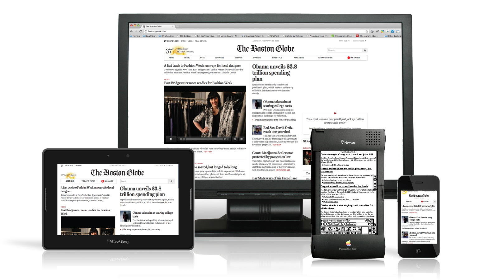
Life is moving at a ridiculously fast pace, and if you believe that the marriage of online content and responsive web design is optional then you cannot be more wrong. It is almost impossible to question the importance of mobile content marketing these days. Therefore, every serious publisher wants to make this transition as comfortable as possible.
This is not the age of using a big desktop computer. Almost everybody has a smartphone these days. No one bothers to switch on his personal computer to find out the latest content. So, if your website is not mobile responsive, you are making a massive mistake.
The good news is that building a mobile responsive website is not an expensive process. There are multiple fascinating mobile responsive designs available these days.
One can write a million word article in reply to the question, that why should your website be mobile responsive. The simplest answer is that the majority of your audience is browsing the internet from their mobile devices.
Folks are on the mobile phones or tablets, browsing all the time. And this mobile lifestyle is growing significantly. With no more mistaken clicks and microscopic fonts, everyone now wants to read content only on the web.
By making your website mobile responsive, you are letting everyone visit your site without any pain. Since, the number of mobile internet users is getting bigger by the minute many renowned companies have made special mobile versions of their website, as they work far faster than the normal ones.


Instructions
-
1
First of all, talk to your website developer, and tell him about your intensions. There is no need to break the bank, because by using mobile responsive themes from Copyblogger’s WordPress theme division - StudioPress, you can get this all done quickly and without spending much money.
-
2
Have a look at all the mobile responsive ready themes, and select the one of your choice. Among the StudioPress themes are: Prose theme, Minimum theme, Generate theme, Eleven40 theme, Balance them, Focus theme, and Streamline.
-
3
When selecting the theme, you need to keep the nature of your website in mind. Not every theme will look good on your website. Play a complete demo of the theme before making the final decision. Having selected the correct theme, you are offering only one website to serve every device.
-
4
No changes in SEO settings are required. You just need to produce quality content, and hit the ‘publish’ button.


