How to Make a Graph in Excel with Logarithmic Scales
A wrong concept has been aired about the accounting system that it is just a side activity that has not direct impact on the business but considering the importance of cash to run the business, the core activity is to sustain a healthy cash flow and that can only be maintained if the accounting system of the company is given importance.
Statistical information can be created with the help of Excel. Different designs are available to us and we can use all sorts of tools to interpret different sets of data available to us. It is highly unlikely that someone will just use Excel software to store data in it. (Excel is software that is being developed by the Microsoft professionals to help people with different statistical and mathematical solutions). Data can be stored in other programs as well but Excel is such user friendly software that it helps you to interpret data with different graphical solutions in a span of few seconds. You can just choose what type of graph you want to create and the graph will be automatically created with a single click. You need to input data and choose different fields.
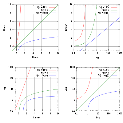
All sort of statistical functions are available in Excel and you can even use user defined functions to run any queries. Graphs are a basic method to represent a data in a form of a picture. Excel has a functionality that uses linear scales as axis by default for a graph. This means that when you are going to plot cash flows of a business over a course of year, they will have a two dimensional graph which has exactly the same number of units in between the ticks. However, when you will plot the changes in the prices of a product which are usually in very small figures, the graph will probably doesn’t reflect the same information that you need. So, to fix the ticks magnitude is changed.


Instructions
-
1
Open the spreadsheet that contains the graph.
-
2
Choose any cell from your data table and click “Insert” tab. Click on chart types and from the category “Charts”. Your chart will be visible on the spreadsheet.
-
3
Choose the “Format” tab. The drop-down menu has an option of axis; choose the one that you want to alter. Choose “Format Selection” that is just below the drop-down box.
-
4
Check the box that is labelled “Logarithmic Scale”. Close the window.
. Data can be stored in other programs as well but Excel is such user friendly software that it helps you to interpret data with different graphical solutions in a span of few seconds. You can just choose what type of graph you want to create and the graph will be automatically created with a single click. You need to input data and choose different fields.
All sort of statistical functions are available in Excel and you can even use user defined functions to run any queries. Graphs are a basic method to represent a data in a form of a picture. Excel has a functionality that uses linear scales as axis by default for a graph. This means that when you are going to plot cash flows of a business over a course of year, they will have a two dimensional graph which has exactly the same number of units in between the ticks. However, when you will plot the changes in the prices of a product which are usually in very small figures, the graph will probably doesn’t reflect the same information that you need. So, to fix the ticks magnitude is changed.Next%20stop%3A%20Pinterest "Pin It")


