Twitter Unveils Its New Logo with Strict Rules
Micro blogging service Twitter has recently updated its official logo, simply a bird flying upward. The change in logo is timely as recently Twitter hit 400 million tweets a day. Twitter said in a blog that “From now on, this bird will be the universally recognizable symbol of Twitter. (Twitter is the bird, the bird is Twitter). There’s no longer a need for text, bubbled typefaces, or a lowercase “t” to represent Twitter.”
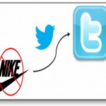
Previously, the social giant has a cartoon-style bird which is now replaced with a simplified little blue bird, without anything else. The new logo was unveiled by Twitter creative director Doug Bowman in the company’s blog.
He wrote: “Whether soaring high above the earth to take in a broad view, or flocking with other birds to achieve a common purpose, a bird in flight is the ultimate representation of freedom, hope and limitless possibility.”
The twitter management has strictly directed its users, web designers, authors and advertisers to follow a long list of rules.
The website demands not to “use speech bubbles or words around the bird.” Besides, you cannot do anything fun like “rotating, animating or duplicating the bird and change its color.”
Twitter wants its user to specifically follow the guidelines, otherwise they might be facing legal actions by the company.
Twitter says the new logo comes from their “love for ornithology, design within creative constraints, and simple geometry.” It says the logo is “similar to how your networks, interests and ideas connect and intersect with peers and friends.”
However, these so called guidelines have become the subject of criticism and mockery over the internet. I think Twitter management has just forgotten that this is the internet. There are a lot of mocking voices who are vigorously mocking Twitter’s new logo rather actually following the guidelines.